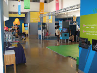
I tend to worship the style of simplicity and straight forward, tell-it-like-it-is design. That's not to say I abhor sophistication. On the contrary, if you communicate clearly and simply through your design, a visitor's interaction will be deep and valuable which is in fact, sophisticated.
Zeum's mission is to foster creativity and innovation of all young people and that means their families too, a very broad audience to reach. The exhibit design strategy I developed was to dedicate each exhibit space to focus on one core activity: Animation, Video and Sound Production, Visual Arts and Performance. This allowed us to be very intentional about which areas to invest resources in first and to develop successful exhibits through prototyping over several years.
I should stop here to say that when I began working at Zeum in 2000, we had just celebrated a 2nd Anniversary. There was a very small staff of under twenty people, a 28,000 sq. foot facility, a lot of empty space and I was the only person in the Exhibits Department. We had a lot of work to do with under 200k. The core team of folks that I worked with was the Executive Director, the head of Visitor Services, IT, and the Education Manager. There were numerous Program Directors over the years however that position was very difficult to define and hire for; it burned people out like a five alarm fire.

No comments:
Post a Comment